
MAGAZINE TEMPLATE DESIGN
Equity Magazine
The challenge
The Australian Shareholders' Association initially approached me to redesign Equity magazine, their monthly flagship publication. The challenge was two-fold: addressing a number of design and usability issues, while also working within a limited budget.
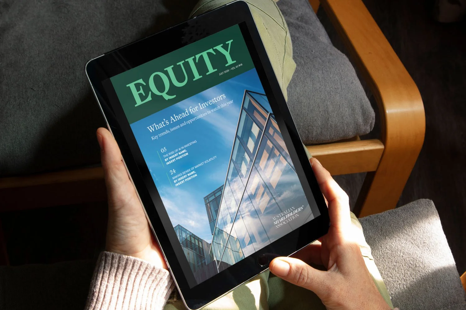
From a design perspective, reader feedback highlighted that the magazine’s small body copy made it difficult to read. The magazine was also increasingly being read digitally on tablets, where the existing two-column layout created a less intuitive reading experience. Readers had to scroll back to the top of each page to begin reading the second column, making the experience unnecessarily cumbersome. The existing magazine also made limited use of the ASA’s visual identity, particularly on the cover. The team wanted to bring their distinctive green colour palette and brand personality more prominently into the publication, while also giving greater visibility to their three key categories: Education, Community and Advocacy.
From a budget perspective, a full magazine redesign alongside the ongoing monthly design work wasn’t practical for a not-for-profit association. So, the challenge became finding a way to refresh the publication while creating a system simple enough for the in-house team to manage independently. Read on to see the solution…
*note: placeholder text and images used in mockups
MAGAZINE TEMPLATE DESIGN
The solution
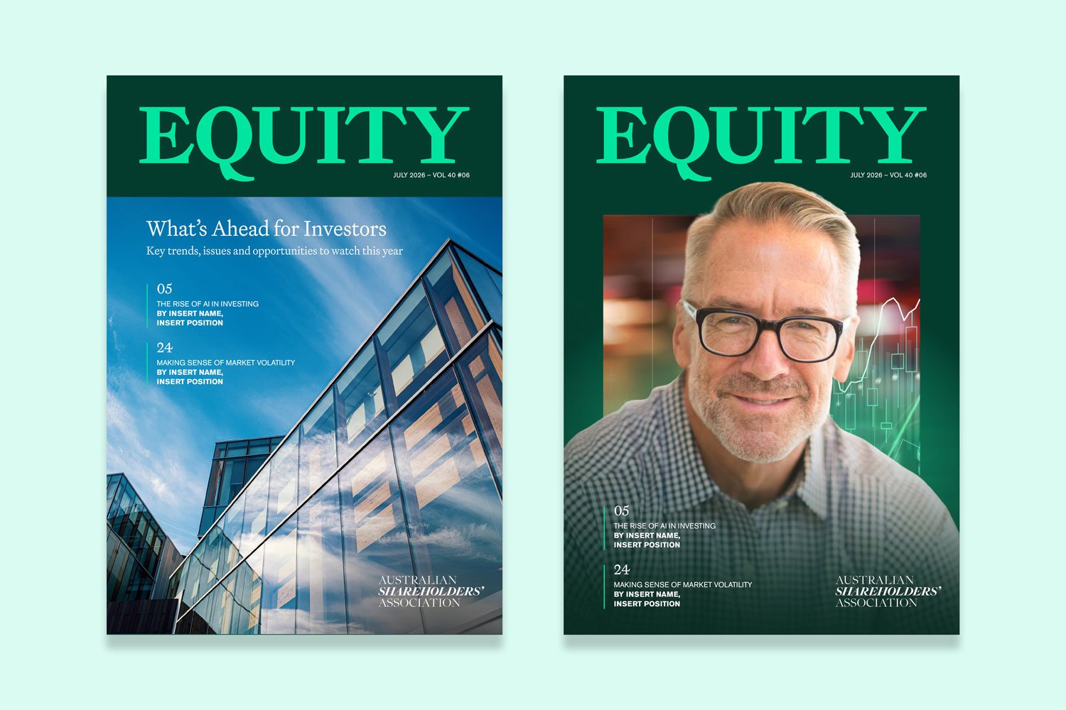
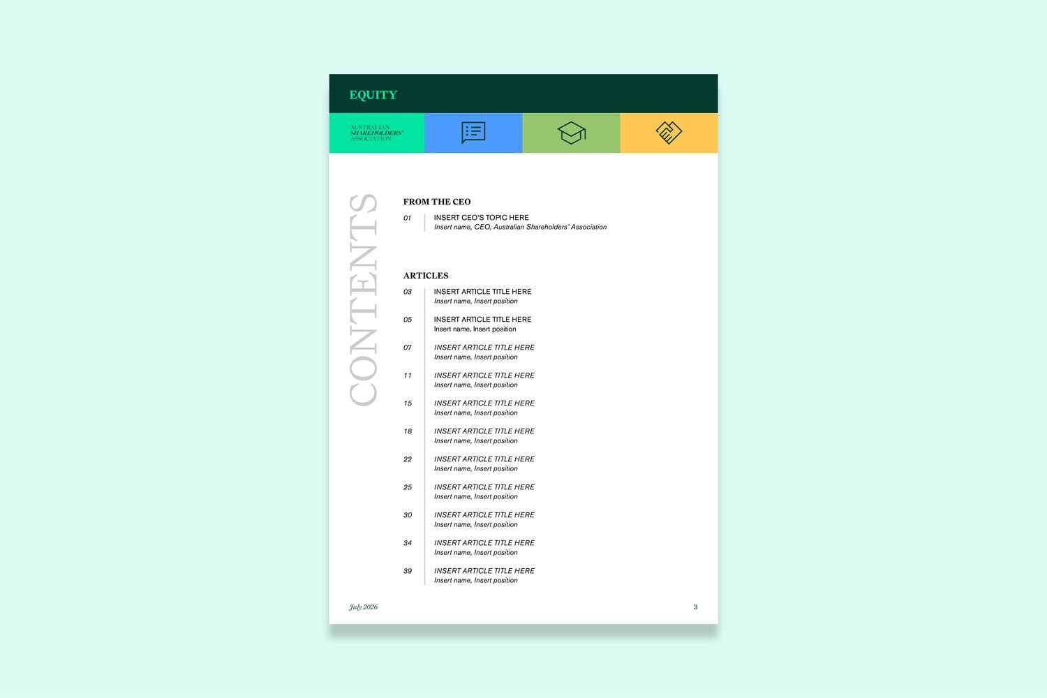
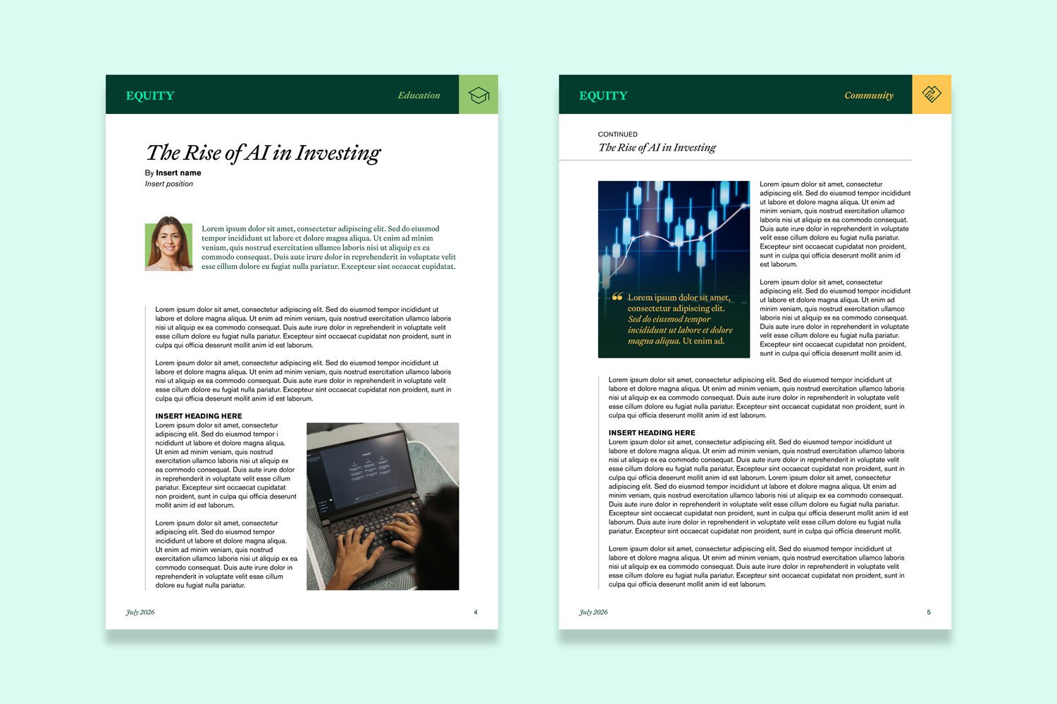
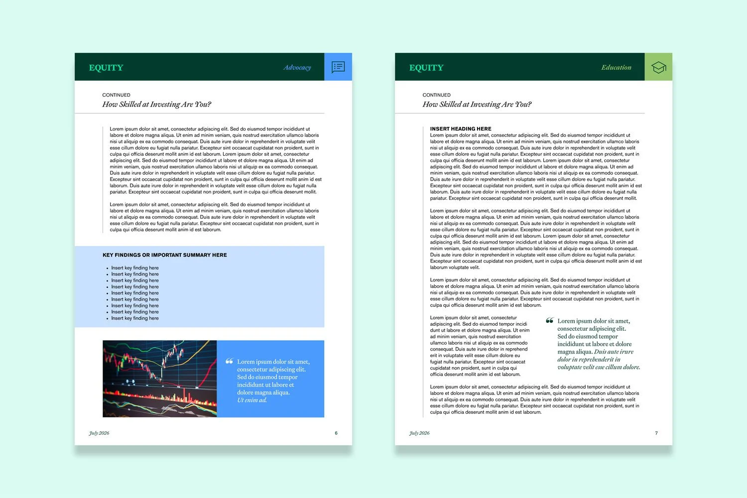
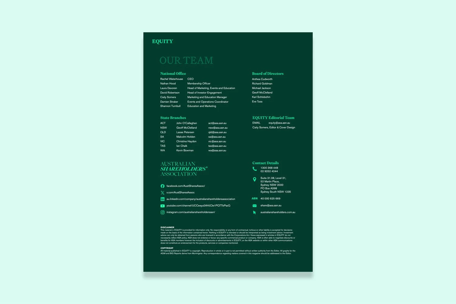
Rather than creating a one-off redesign, I developed a flexible, reusable magazine template in Canva that the ASA team could use for every new issue. The template included two new cover options, a contents page, story page layouts and a dedicated Team page, alongside guidance on using imagery, pull quotes and other visual elements consistently.
A key focus was making the template intuitive for the in-house team. The layouts were designed to be easily populated without requiring advanced design skills, with clear instructions and a video walkthrough to help the team become confident using the system. The redesign also brought the ASA’s green colour palette much more prominently into the publication, creating a stronger visual connection between Equity magazine and the wider organisation. The three key categories were also given greater prominence through a colour-coded tab in the top right of each page, making it immediately clear which category each article belonged to.
The outcome
The result was a magazine that feels professional, cohesive and recognisably ASA, without creating an ongoing external design cost. Most importantly, the team now has the tools and confidence to produce each issue themselves using a template that is both on-brand and cost-effective. The project was a great example of how the right design system can solve an immediate creative challenge while also creating a practical, sustainable solution for the client, giving their team greater ownership and the ability to continue producing high-quality work independently.
Client kudos
“We are publishing today, we made it! Thanks again for creating such a beautiful template for us to use.”
— Caity, Australian Shareholders' Association