
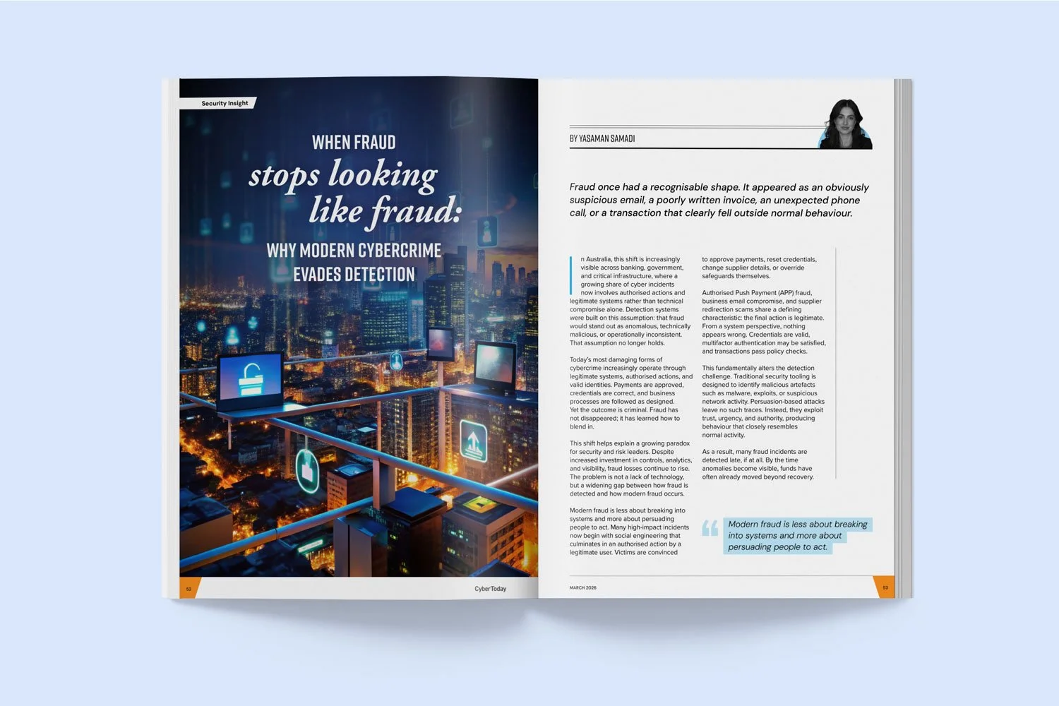
Dark vs light background: Which is better for magazine and annual report readability?
When planning a magazine, annual report or impact report, it's easy to be drawn to dark backgrounds with light text. They look sophisticated, create contrast and can give a publication a premium feel. But while they may look beautiful, are they the easiest for your audience to read?