
Dark vs light background: Which is better for magazine and annual report readability?
When planning a magazine, annual report or impact report, it's easy to be drawn to dark backgrounds with light text. They look sophisticated, create contrast and can give a publication a premium feel. But while they may look beautiful, are they the easiest for your audience to read?
As a publication designer, this is something I consider on every project. A publication shouldn't just look professional; it needs to communicate information clearly and keep readers engaged. So, what does the research say?
In short
Most research has found that dark text on a light background is generally easier to read than light text on a dark background.¹ Researchers refer to these as positive polarity (dark text on a light background) and negative polarity (light text on a dark background). Across multiple studies, positive polarity has been shown to improve reading performance and proofreading accuracy compared with negative polarity.¹²
That doesn't mean dark backgrounds should never be used. It simply means they're most effective when used intentionally, rather than across pages of body copy.
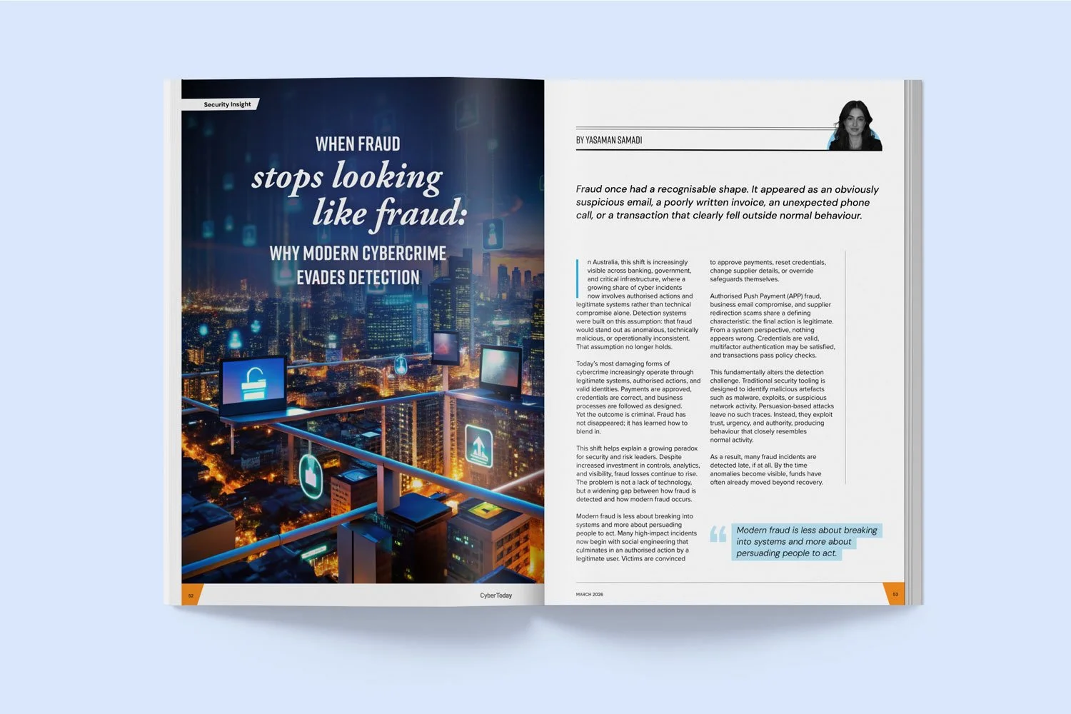
Example 1: CyberConnect magazine
Here's an example from the magazine I designed for the Australian Information Security Association (AISA). I used light text on a dark background for the opening spread to create impact, then switched to dark text on a light background for the rest of the article to make it easier to read.

Example 2: Rio Tinto corporate publication
The same approach was used in this publication I designed for Rio Tinto. Most of the body copy sits on a light background for readability, while a handful of spreads use reversed text to add contrast and visual interest.
How does this affect your publication?
The easier your publication is to read, the more likely people are to stay engaged with it. Whether you're producing an annual report, member magazine or impact report, your goal is to communicate information, not make your audience work harder to absorb it.
One other consideration is accessibility. While readability and accessibility are closely related, they aren't quite the same thing. Accessibility guidelines such as the Web Content Accessibility Guidelines (WCAG) focus on ensuring there's enough contrast between text and its background, regardless of whether the design uses a light or dark colour palette. In other words, a well-designed dark page can absolutely be accessible. The research discussed here simply suggests that, when contrast is sufficient in both cases, dark text on a light background tends to support better reading performance over longer passages.
Researchers are still investigating exactly why positive polarity improves reading performance, but the findings have remained consistent across different age groups and lighting conditions.¹²
What about reading on screens?
With the rise of dark mode, it's a fair question. Many people find dark mode more comfortable, particularly in low-light environments (I usually read in dark mode myself). However, comfort and readability aren't always the same thing.
While users may prefer the appearance of dark mode, studies have found that people generally perform better on reading and proofreading tasks when presented with dark text on a light background.¹² It's one reason dark text on a light background remains the default choice for most books, reports, magazines and long-form web content.
So, should you tell your designer to avoid dark backgrounds?
Nope! Dark backgrounds can be incredibly effective for opening spreads, section dividers or feature pages where the goal is to create visual impact (just like the examples I showed earlier). Where I'd be more cautious is using white text on dark backgrounds across multiple pages of body copy. While it may look striking, particularly in premium printed publications, it can make longer passages of text more demanding to read.
Good publication design supports communication
Publication design is not just about aesthetics. In reality, every design decision should support communication, including typography, spacing, hierarchy and colour. Sometimes (I’d actually say, quite often!) the best design choice isn't the most dramatic, but rather the the one your readers barely notice because the information feels effortless to read.
After all, a beautifully designed publication is only successful if people actually enjoy reading it!
References
1. Buchner, A., & Baumgartner, N. (2007). Text–background polarity affects performance irrespective of ambient illumination and colour contrast. https://doi.org/10.1080/00140130701306413
2. Piepenbrock, C., Mayr, S., & Buchner, A. (2013). Positive display polarity is advantageous for both younger and older adults. https://doi.org/10.1080/00140139.2013.790485